(Nur in Englisch erhältlich)
Big Data Analyis
AVIQ’s OTT devices (Set-Top Boxes and Apps) gather many data points about their usage and technical performance.
These data points are uploaded to cloud-based databases and data mining is applied. With the ATP tracking package, AVIQ’s customers have online access to real-time information as well as historic data.
This data is used for system monitoring, demographic analyses, product & service improvements, ad targeting, etc.
How does ATP Work?

The ATP Tracking Packages are entirely cloud-based and can be deployed for our B2B customer use within hours. Event data is available online approximately one minute after events occurred. All data is anonymous and encrypted, ensuring highest data and privacy protection. Depending on your subscribed ATP package, data is retained for 14, 30 or 60 days for immediate online analysis, and older data can be kept for retrieval for up to 1 year.
ATP Options
AVIQ’s ATP Tracking Package comes in 3 package options to suit different needs and different budgets.
ATP1: Basic monitoring package
AVIQ’s customers receive online access to a set of up to 10 pre-configured dashboards which can be used for real-time monitoring,
analyses and drilldowns of data from customer’s devices. Data is retained for online analysis for 14 days. All dashboards are set to show data for the last 14 days up to current time. Zoom in to other time periods is available in all dashboards. All dashboards are set to refresh the data once per minute automatically.
ATP2: Full-Access tracking package
Everything in ATP1 plus:
- full access to reconfigure the dashboards, visualizations and searches
- a separate cloud space for online data with individual credentials for each user
- data export for downloading and further analysis
- data retention plans for 14, 30 or 60 days of online analysis
- long-term data storage in the cloud for up to 1 year to be used for off-line analysis
- access to all individual crash logs for detailed issue analysis via AVIQ.
ATP3: Mobile Technical Quality Control Package
Monitor your system performance on the go via an iOS or Android smart device app, and get real-time alerts when something is critically affecting your system.
Check activity reports, adoption of new software versions, analytics of crashes for each software version and see stats on the basic device heartbeat event.
ATP1 & ATP2 Dashboards
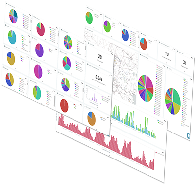
Although ATP processes millions of data points, analyzing and understanding the data is really quite simple. Data is presented in Dashboards which group together analytic data panels allowing powerful technical or behavioral analyses of a specific topic like user behavior or system stability. Here an example of a general Dashboard:
Each Dashboard consists of multiple data panels which can be pie-charts, time-series, tables, numeric data, line-graphs, etc., all grouped together to enable a certain analytic view. The above General Dashboard allows a quick overview of important data like most used devices, software versions, channel switching times, most watched channels, device activity over time, etc.
Check out the Sample ATP Dashboard here! This sample Dashboard tracks a small real-life population of live TIPc7 Set-top Boxes and represents a Dashboard similar to those found in the ATP1 – Basic monitoring package.
Dashboard Details
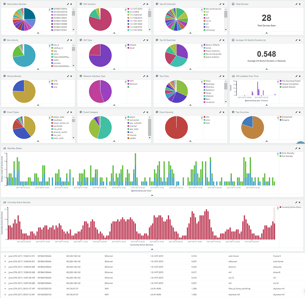
We maintain 10 Dashboards, ranging from general data to very specific information useful for detailed analyses of a certain system aspect. All Dashboards show data for the past 14 days. Dashboard examples:
- General: A quick overview of important data like most used devices, software versions, channel switching times, most watched channels, device activity, etc.
- Events: Shows the important events, usage of Live TV, Catchup, Recordings, distribution of events over time and a tabular list of all events, etc.
- User Behavior: Overview of what users have been doing – watching LiveTV, Youtube, local media or other activities, top watched channels, top recordings, top search strings, etc.
- Geo-Location: Shows the location and regional concentration of devices as they are being used, top countries, top cities, etc.
- Single User: Follow the detailed activity of a selected user over time, their top TV channels, searches, recordings, local Internet bandwidth, streaming quality, video buffers, etc.
- Channel Switches: Show all aspects of the channel switch speed, channels users switched from and to, how long they stayed on a channel, fastest/slowest/average switches, etc.
- Internet Bandwidth & Bitrates: A technical view of measured values for the overall device population or a single device, detailed bitrate switching table with sub-second accuracy.
- Standby Behavior: Timeline of all devices going to and leaving the standby mode, useful to check usage times and plan for data costs
- Update Behavior: A timeline of devices performing software updates, tables with detailed info of old/new software version for each device, failed updates, average update times, etc.
- Errors: list of all recorded errors and crashes with statistics, descriptions of error or crash cause, etc.
Dashboards can have light or dark background. Depending on your subscribed ATP package, you can edit, extend and modify existing Dashboards or configure new ones at will.
Drilldown
In each dashboard, ATP users can drill down inside the data for more detailed analyses.
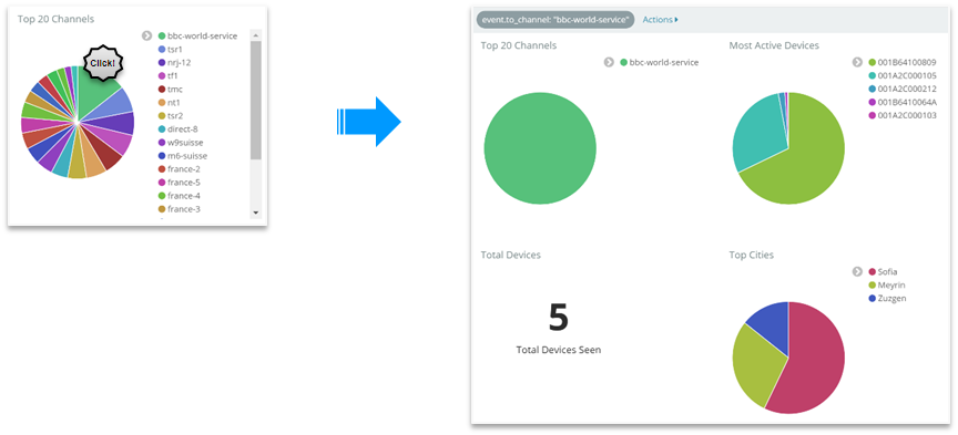
Click on BBC-World-Service channel to see how many and which users watched that channel at what location….or…
- …click on a recorded show to see which boxes have recorded it on which channel
- click on a search string to see which boxes have searched for the same string, e.g. “tennis” or “Game of Thrones”, or…
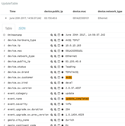
….analyze an event in minute detail: see all data relevant to a completed software update by clicking on the corresponding event in a data table.
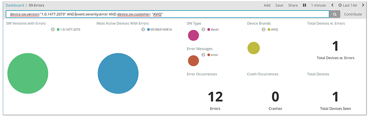
ATP2 users can also write simple filters and use logical operations to filter the data to their purpose, e.g. type:
“device.sw.version:»1.0.1477.2073″ AND event.severity:error”
to see all errors reported for a certain software version:
Timeline Editing
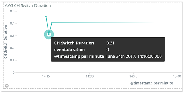
In addition to the drill down capability, ATP users can also analyze data within certain time periods by just dragging the mouse across a timeline, down to the level of minutes or seconds.
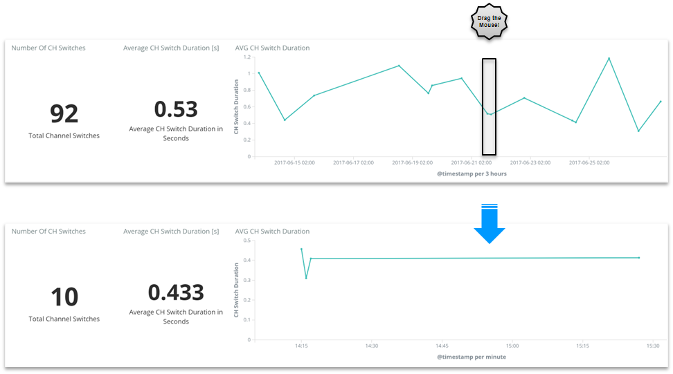
By dragging the mouse users can change the time scale from 14 days to 1 hour and are able to see individual channel switches in the above example. This is useful to analyze many aspects of device behavior: errors or causes of unexpected device behavior, or even just following a user’s path through the evening viewing session (channels they watch, recordings they make, use of Youtube and other apps, etc.)
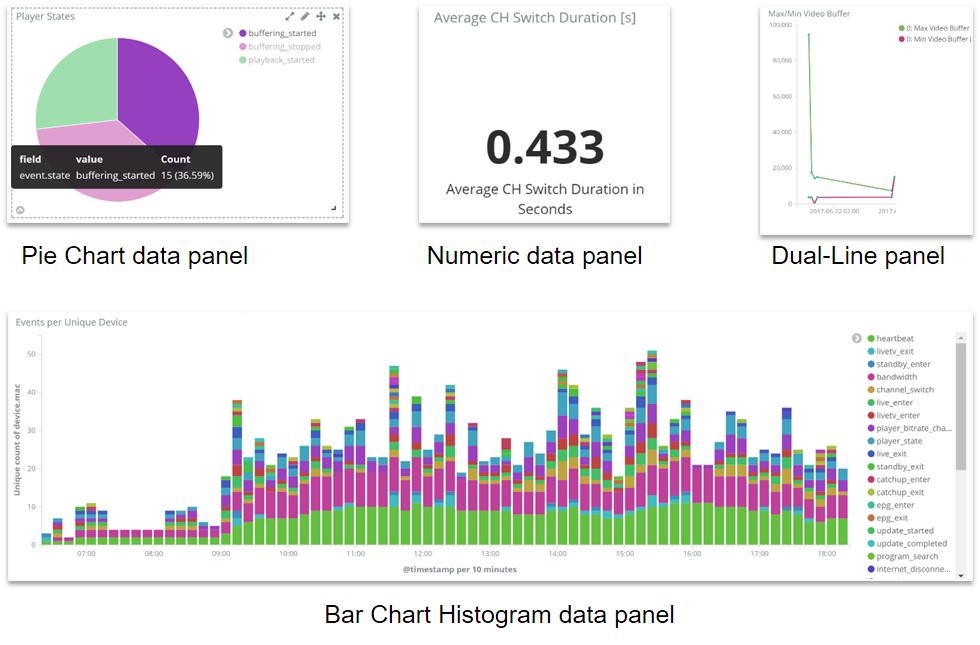
Data Panels
Dashboards consist of individual data panels that can also be moved and positioned at will on the Dashboard depending on your ATP subscription package. We have created over 50 different data panels, and new ones are being added as needed.
All data panels have active, clickable elements used for drill down and tool tips showing the timestamp of an event and its name and value. Here are several examples of data panel types.
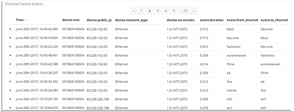
Data tables provide extensive details of events on a time-scale.
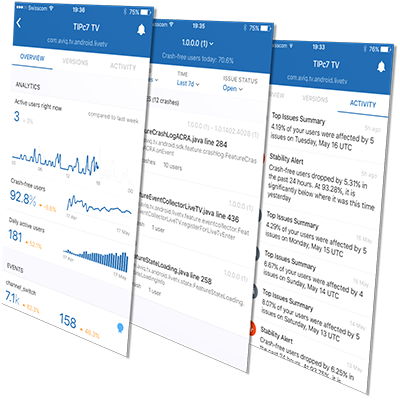
ATP3: Mobile Technical Quality Control package
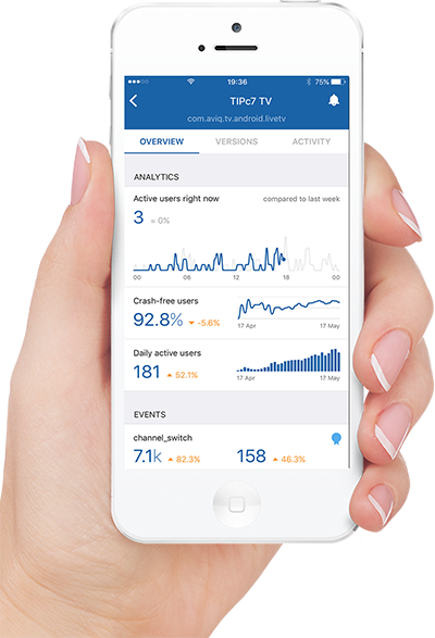
Monitor your system performance on the go via an iOS or Android smart device app:
- Get real-time alerts when something is critically affecting your system
- Check activity reports, adoption of new software versions, analytics of crashes for each software version and see stats on the basic device heartbeat event.
Data on all pages is updated instantly.
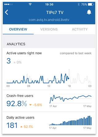
The Overview page shows the most important summary data about the system:
How many users are active at the moment and how that number compares to last week’s numbers. Active users are those who have actively used their device (STB or App) in the past 30 seconds.
How many users are crash-free today and in the past 30 days, for all software versions
How many users were active today and in the past 30 days
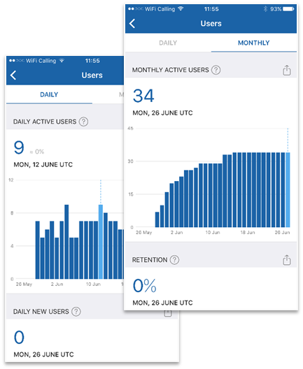
Each of the above analytics panels can be tapped for drilling down to find out more. As an example, the Users pages show various information about the user base on a daily or monthly basis.
Active users, new users and user retention can be analyzed.
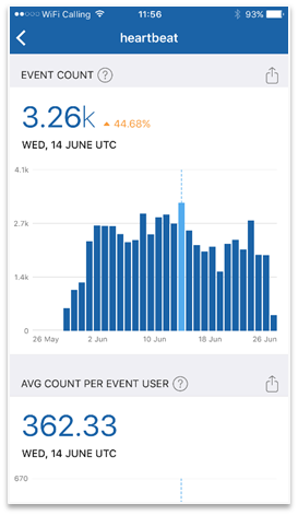
The Heartbeat event is sent regularly by all active devices to show that they are alive.
In the Heartbeat page you can analyze how many heartbeat events have been sent each day, how many users/devices had sent them and how many heartbeat events have been sent by the devices on average.
This helps ATP customers to gauge how active their users are.
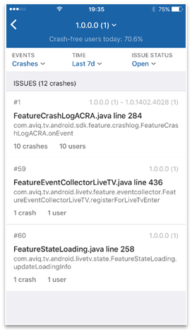
Tapping on the Versions Tab allows to analyze the stability of the devices: number and frequency of crashes for each software version as well as checking the description of crashes for certain software versions in a chosen period. The number of affected users is shown for each crash.
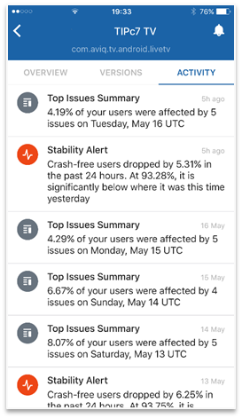
In the Activity Tab all system notifications are shown, as summary reports or alerts. ATP users can set the level of push notifications from none, via most critical, priority notifications or all.
Notes: ATP users are required to download and install the tracking app from Google PlayStore or Apple Store and will receive access credentials from AVIQ. This package is independent of the Basic or Full-Access ATP packages and can be used in addition to those packages. Data is retained for 30 days.

